| Entrance | Mainstreet | Wiki | Register |
|
# of watchers: 11
|
Fans: 0
| D20: 13 |
| Wiki-page rating |  Stumble! Stumble! |
| Informative: | 0 |
| Artistic: | 0 |
| Funny-rating: | 0 |
| Friendly: | 0 |
Previous:  | Up: gallery 1675 | Next:  |

2010-04-02 [NOOOPE]: Before I give a legit comment, could you make it like... img500: or something so I can click it and expand it in a new window? Right now it's too long and the side bar is cutting off a lot of it.
2010-04-02 [Aeolynn]: done!
2010-04-02 [NOOOPE]: Since you're new to PS, here's some cool ass shit to look at:
http://shadowu
http://novawuf
Though, these are for like... super realistic drawings and yours seem more along the lines of lion king.
Something like this might help you get more ideas:
http://makani.
http://makani.
http://makani.
Just how the fur is suggested but it's very subtle. It isn't extremely streaky, just in some select areas. Also, I love how this artist uses tones in her animals and gives them huge personalities.
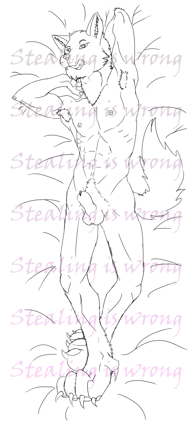
I really like the energy in the poses you gave the animals. They really do look like they're in motion. I would, however, be careful about anatomy. Their bodies look like they could move and be real but they don't look like lion or wolf bodies. They look like the dragons you draw, which are awesomely shaped, but these aren't dragons.
Here's another artist you can look at in regards to animals. She's rockin' ->http://sandora
2010-04-02 [Aeolynn]: I actually know that last artist! Well, I know her work XD thanks M.
Though, I don't think I'm really up to that realistic skill level, I'm definitely saving all those for refs :]
2010-04-03 [Chel.]: I'm not sure if it's part of your style or not, but I think their mid sections are a bit too long and ferret-like.
A lion's build is a bit more "stocky" Like this:  There is actually no (or a very little) arch up in the underbelly.
Same goes for a wolf. Also, if you wanted to be more anatomically correct, a lion significantly larger then a wolf.
As far as rendering goes, this is actually quite good for an early photoshop work. Mine were gawd awful in the beginning! My suggestion would be to try manipulating the brushes you are using in the brushes panel. Make sure "shape dynamics" is checked on. This allows line to fade in and out according to one's pen pressure. I didn't learn this til recently and it's AWESOME.
2010-04-03 [Aeolynn]: Yeah I can see that, about the bodies... and I think it is my style. XD and about their sizes, they're about the same height, so their fursonnas' are the same size basically.
2010-04-03 [Chel.]: Yea, I wasn't totally sure, so I just said what I did. :P Heh.
2010-04-04 [NOOOPE]: Ooo! Aeolynn, this is super cool! I like the parchment paper. I also like the directional line and the value shifts. The only think I think could be changed is make making the lines less black. If it's a little more brown, it'll look faded and fit on the parchment better.
2010-04-04 [Chel.]: OOOooOOoo yea! I agree with M. Or you could put the lines on a multiply layer in photoshop and that texture could really come through. If you don't know how, I can help.
Otherwise, yea, this is really awesome.
2010-04-04 [Aeolynn]: Sorta like this?
2010-04-04 [NOOOPE]: Yes! Very cool.
2010-04-04 [Daisy_Sandybanks]: I like it so far.
I feel like the back leg and tail should be faded a bit more though. That way you'd get a good sense of depth and perspective.
2010-04-04 [Aeolynn]: It's a cape XD
2010-04-04 [Daisy_Sandybanks]: Hah, whoops.
Ok, well fade the cape a bit then?
Or make it look more like a cape? :/
2010-04-19 [Keylla]: It's good, a bit more shading with the armor, or something, because for me it kind of all blends detail-wise together, unless it's supposed to be like that, over all though, i like it :D
2010-04-26 [pegasus1000]: First thought Ugh WOW… Then I put my bias aside to the actual artwork. And said “Cool”
-I agree with [Keylla] It would be nice to see this done with better shading. (or with more then one technique.
-(I hope this doesn’t sound rude) Did you only use one pencil? (If yes)When you only use one pencil you are limited in your shading and I hope that if (When) you continue to work in this line of drawing you will consider your tools.
- You really did do a good job on the definition in the arms and head. You have a lot of potential for this piece. I like the stance your character is in. It is a hard one to draw without something to model after. Keep working on it.
2010-04-27 [Aeolynn]: 1. this is a digital drawing, so only one 'pencil' used
2. this was a 4 dollar commission, spending more time on it would be even more of a steal then it is
3. pose is EPIC.
:D
| Show these comments on your site |
|
Elftown - Wiki, forums, community and friendship.
|